Using CSS to style frontends
Cascading stylesheets (CSS) are an important part of any frontend user interface. The default project template is configured to include a basic stylesheet that you can edit, but you may prefer to import your own custom stylesheet or use an alternate format. This guide illustrates how to style the default frontend canister using SCSS, the default format used by dfx new when creating React frontend canisters.
Prerequisites
Before you start, verify that you have:
[x]
Node.js16.0.0or newer installed for frontend development and can install packages usingnpm installin your project. For information about installing Node for your local operating system and package manager, see the Node website.Downloaded and installed
dfxversion0.17.0or newer.
Create a new project
You can either create a new project using dfx new, or you can follow the default frontend canister tutorial to setup a project that includes a React default frontend canister.
If you’ve never used React before, you might want to explore the intro to React tutorial or the React website before editing the frontend code.
Viewing the default stylesheet
In the project custom_greeting, the default stylesheet for the frontend is stored in the file src/custom_greeting_frontend/src/index.scss. This file is imported to the src/custom_greeting_frontend/src/main.jsx file through the line:
import './index.scss';
Recall that in this default template, the main.jsx file is used to render the App content exported from App.jsx, and is then imported into the frontend's entrypoint index.html file.
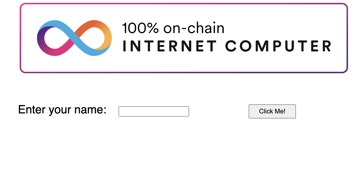
By default, this file contains the following code:
body {
  font-family: sans-serif;
  font-size: 1.5rem;
}

img {
  max-width: 50vw;
  max-height: 25vw;
  display: block;
  margin: auto;
}

form {
  display: flex;
  justify-content: center;
  gap: 0.5em;
  flex-flow: row wrap;
  max-width: 40vw;
  margin: auto;
  align-items: baseline;
}

button[type="submit"] {
  padding: 5px 20px;
  margin: 10px auto;
  float: right;
}

#greeting {
  margin: 10px auto;
  padding: 10px 60px;
  border: 1px solid #222;
}

#greeting:empty {
  display: none;
}
With this styling, the default frontend looks like this:

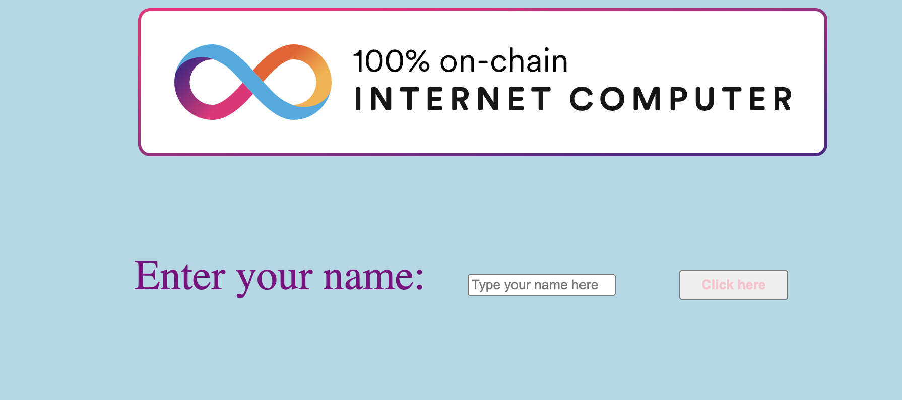
You can edit this style sheet to change the existing defined style, such as altering the font size, margin, border, and padding values, or you can add new style components, such as a background color. Here's a revised example:
body {
  font-family: serif;
  font-size: 2.6rem;
  color: purple;
  background-color: lightblue;

}

img {
  max-width: 100vw;
  max-height: 100vw;
  display: block;
  margin: auto;
}

form {
  display: flex;
  justify-content: center;
  gap: 0.5em;
  flex-flow: row wrap;
  max-width: 40vw;
  margin: auto;
  align-items: baseline;
}

button[type="submit"] {
  padding: 5px 20px;
  margin: 10px auto;
  float: right;
  color: pink;
  font: serif;
}

#greeting {
  margin: 10px auto;
  padding: 10px 60px;
  border: 10px solid #222;
}

#greeting:empty {
  display: none;
}

Using multiple stylesheets
Your application can use different stylesheets for different pages or sections of your app. Simply change the import statement to point to another stylesheet that should be used, such as:
import './another-stylesheet.scss';